| Home | Welcome | What's New | Site Map | Glossary | Weather Doctor Amazon Store | Book Store | Accolades | Email Us |
 | |||||||||
Weather Almanac for August 1999MAPPING THE CHANGING SKYI recently had the opportunity to fly from Victoria to Toronto, and I took along a newly acquired book to read and review: Air Apparent by Mark Monmonier. The book chronicles the history of the weather map from the first climate chart prepared by Edmund Halley of comet fame to the multi-media productions available on the cable weather channels and the internet. The trip and the book reminded me of my long fascination with weather maps and maps in general. 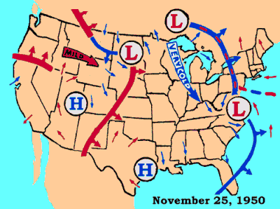 I have been a map addict most of my life. Those few times I feel a spell of boredom coming on, I need only pull out an atlas or road map and I am on a mental excursion to somewhere interesting. And weather maps! Why I can study them for hours on end, picturing the weather prevailing at some distant city by mentally decoding the station report and painting a weather scene in my mind from it. Or I can look at the larger picture and visualize a storm system sweeping across the continent. Are the thunderstorms severe in Des Moines? Will it finally cool in Springfield? I can still vividly recall my first weather map, which I got in the late 1950s. It was a kraft-paper map of Chicago and surrounding area used by local weatherman P.J. Hoff on the late news. The map was oval, about three feet wide and two high, with cut-out clouds and sun attached with tape to give a three-dimensional feel to the map. Temperatures and other information were written on the map in black crayon. (No need for fancy graphics, most of us still watched in black and white.) The feature I loved the most was the two flags on the right side. The lower one displayed the forecast overnight low temperature and the second, which Hoff raised upward by a string, gave the forecast high. And in the corner of this particular map was an inscription from Mr Hoff to me! This map remained on my bedroom wall for several years before the effects of wind and sun entering the window demanded its removal -- a proper end for a weather map. I was in my early teens when I first held an official U.S. Weather Bureau Daily Weather Map. Unfolded to its fullest extent, it filled my desktop. In the centre and dominating the page was the surface weather map for the date. Smaller maps indicated the previous day's maximum/minimum temperatures for selected US cities, precipitation totals and areas with rain/snow hatch-marked and snow-on-the-ground isolines. Also included was the North American 500 mb map. If I remember correctly, the map also contained a simple station model key to the plotted data. My first map had on its back side a large chart giving the complete key for all the weather symbols -- a regular feature, I was to find, on the Sunday map. Later, I found that I could receive these maps daily through the mail for a rather modest subscription fee, and I did so for several years. Each day I would study the movements of air masses and fronts, and occasionally the assault of a hurricane on the Atlantic or Gulf Coasts. As an added bonus, Saturday maps often featured added text describing a relevant weather element: thunderstorms, blizzards, tornadoes, etc. While I studied meteorology at the University of Michigan, the department weather lab with its wall of recent "fax" charts was a frequent meeting place for students. The quality of those maps was poor compared to the crisp printed versions received through the mail, but they were "real-time" maps that we could use to forecast Ann Arbor weather or check on the weather back home. Through the years I have had the opportunity to revisit those daily surface weather maps in conjunction with various research projects, and I always stop to look beyond my geographical focus for the study. How hot did it get in the deserts of the southwest United States and northern Mexico? Isn't that snow reported in Saskatoon a little early? I bet those Oklahoma thunderstorms were a sight to see. Today with access available over the Internet to a variety of maps and supporting satellite pictures and radar reports, any special weather event can be analyzed right in my own home. A few weeks ago I was able to see the why behind a subtle but chilling change in local weather as a small low developed over the mainland and pulled cold ocean air through the Strait of Juan de Fuca at gale force. With our perspective of the weather today from constant satellite views, it is hard to realize that the concepts of large-scale weather patterns are barely two centuries old. Benjamin Franklin may have been one of the first to realize this. His thinking on storm structure was stimulated by the occurrence of a lunar eclipse which he was prevented from seeing because of a clouds associated with a storm. The storm blew thick clouds into Philadelphia on northeasterly winds. Franklin was surprised, however, to later read accounts of the eclipse in the Boston newspapers, "for I thought, as the storm came from the northeast, it must have been sooner at Boston than with us..." he wrote Jared Eliot. "I wrote to my brother about it, and he informed me that the eclipse was over there an hour before the storm began." Franklin kept track of newspaper accounts and comments of travelers and correspondents for several years before he concluded that it to be a "constant fact that north-east storms begin to go leeward and are often more violent there than farther to windward." That is, storms often traveled from a different direction than that of its winds and moved as an entity across the region. There were few attempts to map the weather patterns we are so familiar with today until the advent of the telegraph network allowed observations to be gathered relatively quickly across a wide geographic area. Prior to the telegraph, observations would have to be delivered by mail or courier, and data were rather stale when finally received. (It is interesting to note that four of the most influential technologies on weather forecasting were first developed for totally different purposes: the telegraph, the computer, radar and satellites.) 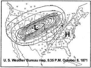 Even the concepts of warm and cold fronts which we take for granted on our weather maps met with much initial opposition, particularly in the United States. Fronts did not become a feature on official US weather maps until the 1930s, over a decade after being proposed by Norwegian meteorologists lead by Vilhelm Bjerknes. And then they were only accepted through the lobbying of President Franklin Roosevelt by the airline industry who wanted, among other things, for frontal analysis to be part of official weather map production and forecasting. Today, a weather map looks bare without cold front and warm front symbols between the Ls and Hs that show the locations of high and low pressure centres. In fact, most viewers can catch the essence of the local and national weather picture from a base map with only these symbols placed on it. I miss the contouring of isobars on most weather maps I see on TV or in the newspapers. There is something I find esthetically pleasing about the smooth sweep of those contours, which give the map a visual quality like the sweep of a symphony gives the ear. They seem essential to me to counter the sharpness of the fronts and the flatness of those basic Ls and Hs. As I look at the August weather maps on my screen, I can see the polar storm systems beginning to sweep a little further south as the month progresses, a sign of summer's waning strength. Even as the thermal lows become more prominent in the American Southwest and those double-tailed comma symbols of tropical storms and hurricanes appear in the subtropical Atlantic Ocean, the first cold air masses begin to form in the Arctic and slip across Canada, the Great Lakes basin and New England States. The sun begins to set noticeably earlier now than at the start of the month. Time to "make hay while the sun shines." A final note. News arrived recently of the passing of Clint Youle at age 83. Youle was one of the first regular TV weathermen (some say the first), reporting the weather from Chicago's NBC affiliate beginning in 1948. I remember watching him in my youth. By today's standards his reports were primitive but they definitely opened my young eyes to the breadth of weather. Learn More From These Relevant Books
|
|||||||||
 |
To Purchase Notecard, |
Now Available! Order Today! | |
 |
 |
NEW! Now |
The BC Weather Book: |